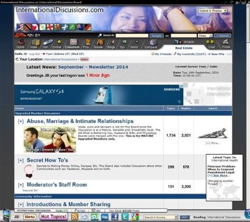
 Close Topic Options
Floating Bottom Bar - Page 5 of 5
Bottom Bar Removed Today, I moved the Bottom - Page 5 - Community News, FAQ, Feedback - Posted: 17th Sep, 2014 - 11:13pm
Floating Bottom Bar - Page 5
Thank you for your insight. Those were just rants from the top of my head. I agree my choice of using the word spam was wrong, and I never thought of switching styles between posting and reading. I guess I am just being overly needy because I have the freedom to edit and change 98% of everything I see and it doesn't match the rest of it. I apologize if I sounded like a little kid complaining about what color his birthday cake was.
I knew my input wouldn't go far, but at least I learned a thing or two. Also I was not suggesting one for linux users, just a more simplified version, Both current versions look and work great for me, its just not my taste. However, I will not let such silly things keep me from using posting on this beautiful community.  Edited: Anoki on 10th Aug, 2013 - 8:06pm
Bar Bottom Floating
How did you know that? I am always willing to implement things once I see a need for it. In fact, yours is not the first complaint about the Bottom Bar and so the Mobile Skin was born even though there was already an existing Text version of the site. The Mobile Skin, removed the Bottom Bar and any kind of positional images or Ads, it is relatively new and was solely created to help some of the Dungeon Masters / Players here who had slow systems or only accessed with their phones. You can see how it evolved here: Wap / Mobile Viewing.
You shouldn't because it is beautiful... In all humility of course.
Floating Bottom Bar Feedback & FAQ News Community
This might be on my end as well but on the full version I was having resolution problems with the right side of the bar running off my screen on full version and the text was too big. I never gave it much thought because a lot of sites do this and it's easy for me to change my screen resolution on the fly, but all of the other borders and such fit well. But now after selecting mobile version the text scaled perfectly to my second monitor (Unlike full version).
A weird reverse effect of this is the text version is too small to read.
It's not that often that a website owner is willing to meet the ideas of the general public. But hats off to you for doing it, I was unaware that you were this flexible.
Page 5 Bar Bottom Floating
Once there is a majority need sure. Sorry to say in your situation it seems like an isolated case and really not related to the Bottom Bar alone.
The right side of the Bottom Bar does default to running off the Screen on the right side, it is part of how I take control of the user's browser.
Again, text size issues seem to be localized as is apparent in a Discussion here: Wap / Mobile Viewing. Now that you are using that Skin this Thread should not matter unless you choose to join the rest of us in the visual realm by upgrading to a more full browser experience.
There are Role-playing Games here ironically like Plugged which is based on the Matrix and is highly graphics / flash based. If you ever wanted to participate in it you will need a majority based full browser. You are also welcomed to use the appropriate Thread and Upload a screenshot of what you see.
Bar Bottom Floating
Bottom Bar Removed
Today, I moved the Bottom Bar for various reasons none of which I really liked. Most will be happy for this because it means that there will be no more 'floating' objects around the site. Despite this, I have found ways to integrate the information the Bottom Bar had to other parts of the Community. As you browse you will notice them.

Floating Bottom Bar (Hover)
 TOPIC: Floating Bottom Bar